YouTube has become synonymous for bombarding us with ads prior to any video we watch. While most of them are annoying and obnoxious, there are those few ads that come along that intrigue us and we pass on clicking “Skip ad.”
Axe’s latest campaign happened to be one of those said ads. The “Tatawor El Tazbeet” ad of the New Axe campaign is a brilliant example of creative, branded video content.
Inspired by the insight that the dating game has changed so rapidly in our digital age, the ad plays heavily on nostalgia, with its well-chosen props that appeal to Axe’s target segment.
The video is cheeky, yet it smartly skirts around the region’s particular tastes with hints of naughty humor. And although it references the past, the ad manages to remain modern with its electro-pop jingle and playful style.
The Music
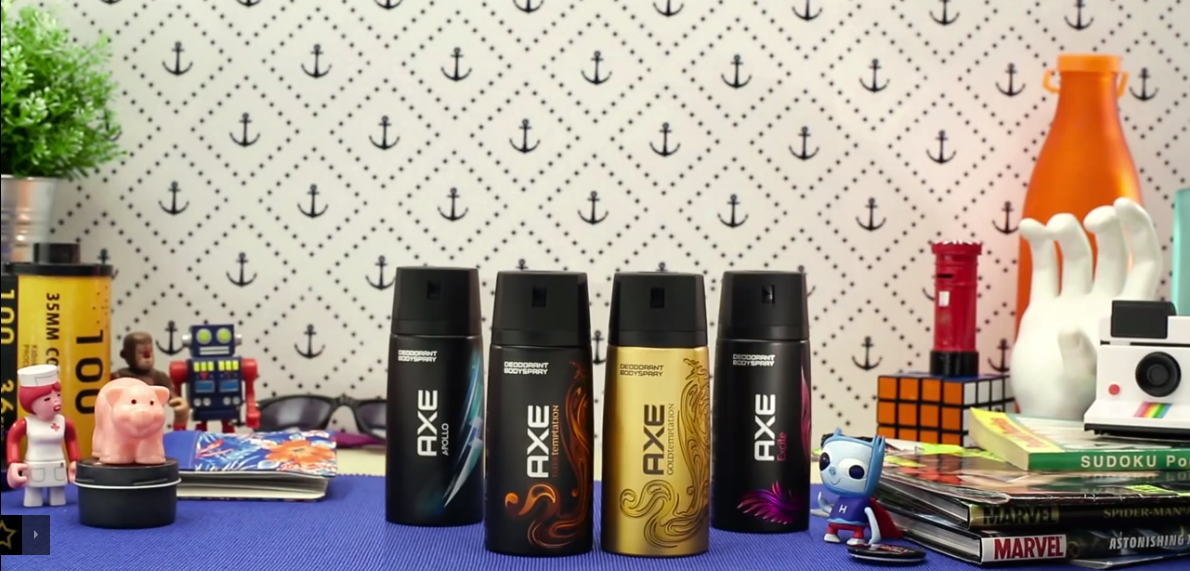
We have to give credit where it’s due and tip our hats off to the guys responsible for the catchy jingle, which suits the ad perfectly, from the bass of his voice to the inclusion of the female singer and the song’s sudden pauses.
The Humor
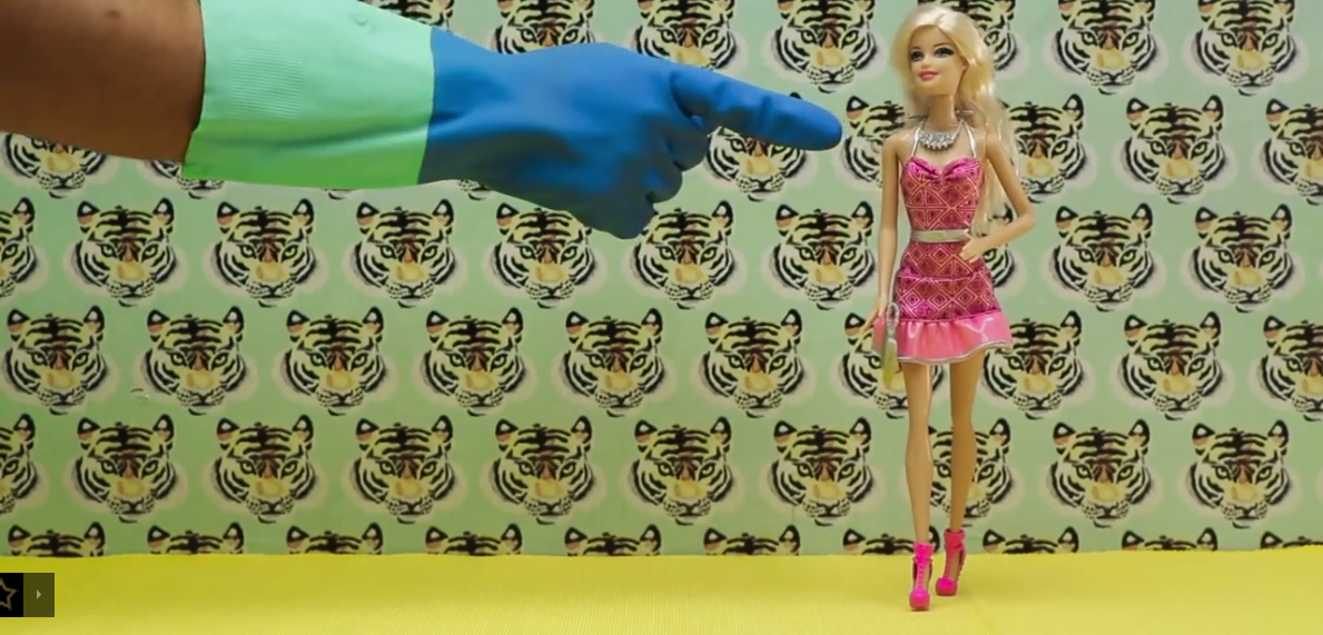
The video is light, cheeky and fun to watch, but more than that, it captures the essence of the Axe brand to the point.
We must point out, though, that this does alienate a very large part of the consumer base that does not necessarily summer in Hacienda or understand the references made, thus alienating what could have been a new market base that needs and uses deodorant.
The References
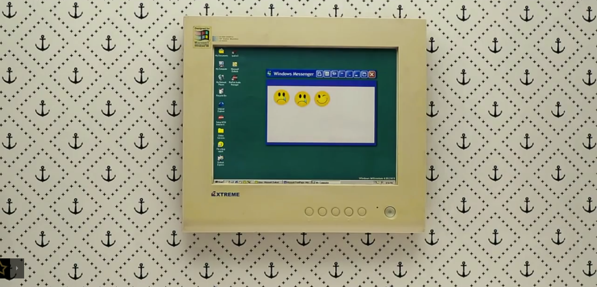
Nostalgia is used often in advertising and when executed well, can be a sure winner. The well-chosen references to tazbeet “back in the day” and comparison to aspects of modern dating are specific enough to be memorable but general enough to be relatable.
This does, again, however, alienate a younger segment of 16- to 18-year-old males, whose main goal in life is to land that leading lady, possibly with Axe by their side, but who do not share the same nostalgic feel that the video relays to those who lived through the late 90’s and early 2000’s.
The Visual Effects
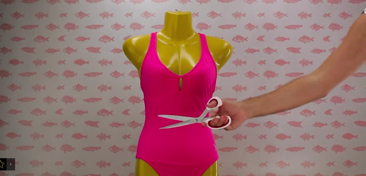
The video’s quick pacing and editing, set in perfect sync with the lyrics and music, grab the viewer immediately, while the stop-motion of the objects keep you watching until the end.
Like we said, exactly why we didn’t skip that ad!
The Interactivity
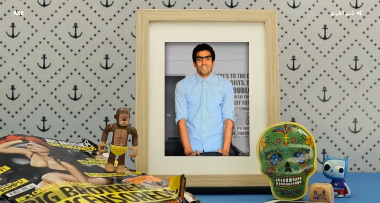
Perhaps the best part of the New Axe campaign is the interactive element, where you can upload up to four photos of yourself showing how you’ve changed over the last seven years. A personalized video is then generated with your images displayed in the picture frames of the ad. This brilliantly encourages engagement and sharing, which are important needs for any brand that most seem to forget about.
In fact we couldn’t help but to create our own! Check it out here.
WE SAID THIS: Round of applause to the digital agency who brought this to life, Digital Republic.


