Creating a logo with AI tools can feel empowering—quick, easy, and full of options. But the same speed and convenience can also lead to rushed decisions, generic results, or overlooked branding opportunities. It’s tempting to click “download” and call it a day.
A logo is more than just a visual asset. It represents your identity, your values, and the promise you make to customers. That’s why even when using AI, thoughtful customization and strategic oversight are essential.
In this article, you’ll learn:
- The most common mistakes people make with AI logo tools
- How to avoid design shortcuts that cost you in the long run
- Practical tweaks to elevate your generated logo
- Tips to align your final design with your brand personality
Let’s dive in…

1. Skipping the Brand Discovery Phase
Jumping straight into logo generation without knowing your brand values is a common pitfall. Your logo should reflect more than just your business name.
For example, a playful children’s brand needs a very different tone than a luxury skincare line.
Write down 3–5 words that describe your brand. Use them to filter and judge all design choices.
Don’t be afraid to slow down at the start. Strong logos come from strong concepts.

2. Choosing Generic Icons
AI tools often suggest popular or overused symbols—globes, lightbulbs, shopping carts. While easy to recognize, these icons can feel impersonal.
Imagine a tech startup using the same gear icon as dozens of others. It loses impact fast.
Instead, aim for abstract or customized iconography that reflects your niche.
Here’s the trick: Look beyond the obvious to find something unique.

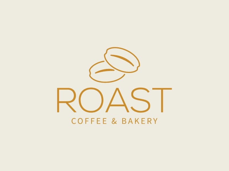
3. Ignoring Typography’s Role
Fonts aren’t just decoration—they signal personality. A serif font adds heritage. A bold sans-serif screams innovation.
Let’s say you run a boutique law firm. A playful handwritten font would send the wrong message.
Match your font to your tone. If you’re unsure, test a few styles in mockups.
Pro Tip: Keep your visual identity consistent across all channels.

4. Letting the AI Make Every Decision
AI is a starting point, not the final say. The best results come from active editing—spacing, alignment, color correction.
One example: a bakery logo where the icon looks too large next to the brand name. A few manual tweaks fix balance instantly.
Most tools, like AI logo maker Turbologo, allow easy adjustments. Use them.
Remember: ownership begins with customization.
5. Overcomplicating the Design
It’s easy to get excited with effects—gradients, shadows, layered icons. But complex logos struggle in small formats.
Think of brands like Twitter or Nike. Their logos are iconic because they’re simple.
Test your design at 32×32 pixels. If it’s unreadable, simplify.
Sounds simple? It is. But many overlook it.
6. Ignoring Color Psychology
Colors carry emotion. Red is bold, blue is trustworthy, green is natural.
If your wellness brand uses neon purple, you might confuse your audience.
Start with 2–3 brand colors. Test them on light and dark backgrounds.
Consistency in palette makes your brand memorable.

7. Forgetting Versatility
A good logo must work across formats—website headers, app icons, packaging.
Try exporting your AI-generated logo into different mockups. Does it look balanced in a square? On a business card?
Turbologo and similar platforms let you preview logos in context.
Don’t skip this. Visual testing reveals what static previews hide.
8. Not Creating Multiple Variations
You’ll need a full logo, icon-only version, and horizontal/vertical formats.
Imagine using your full logo on Instagram profile pics—it won’t scale well.
Save vector versions in SVG or EPS so you can resize without quality loss.
Examples of Creative Logo Approaches: Spotify (symbol + sound), Dropbox (abstract box), Airbnb (symbol + story)
9. Relying on One Format Only
Downloading only a PNG file limits how and where you can use your logo.
Ensure you get transparent versions (PNG), print-ready files (PDF), and editable vectors (SVG).
Organize them clearly. Label sizes, uses, and color variations.
Here’s the move: Treat your logo like a toolkit, not a one-off asset.
10. Failing to Document Brand Rules
Even if you’re solo, write down a few rules: color codes, font names, spacing guidelines.
This ensures consistency across social posts, ads, packaging, and website elements.
Create a 1-page brand sheet and update it as you grow.
Don’t wing it. Strong brands are built on clarity.
Conclusion
AI logo tools offer a powerful shortcut—but they still need a designer’s mindset. By avoiding these common mistakes, you can turn a fast design into a lasting identity.
Take control of the details, think beyond automation, and build a logo that reflects your story—not just your style.
The best logos aren’t just generated—they’re crafted.
WE SAID THIS: DON’T MISS…UAE Schools to Teach AI at Every Grade Level: Here’s What Students Will Learn