Egypt is witnessing a new era in its history. The economy is massively developing with very bold and risky governmental decisions. Modern national projects that involve tourism, industry and fuel are taking place massively and in a short window of time, which might not be paying back right now, but we are promised payback somewhere in the near future.
In celebration of this awakening era in our modern history, the government found it crucial to introduce new designs for the currency in the country.
A currency profile is an artistic journey that celebrates its history and represents the pride of its achievements, making the design a vital factor when it comes to introducing a new currency to the people.
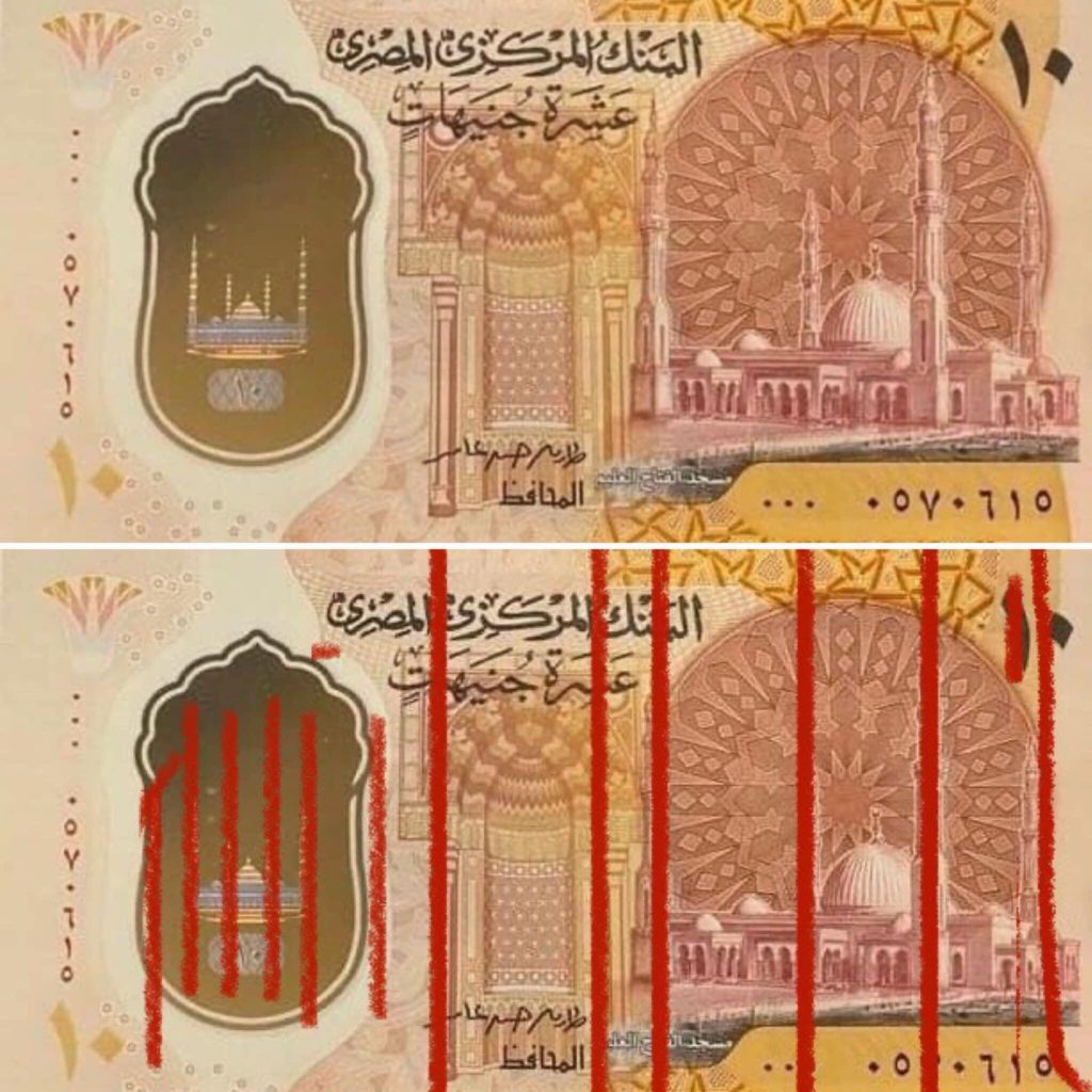
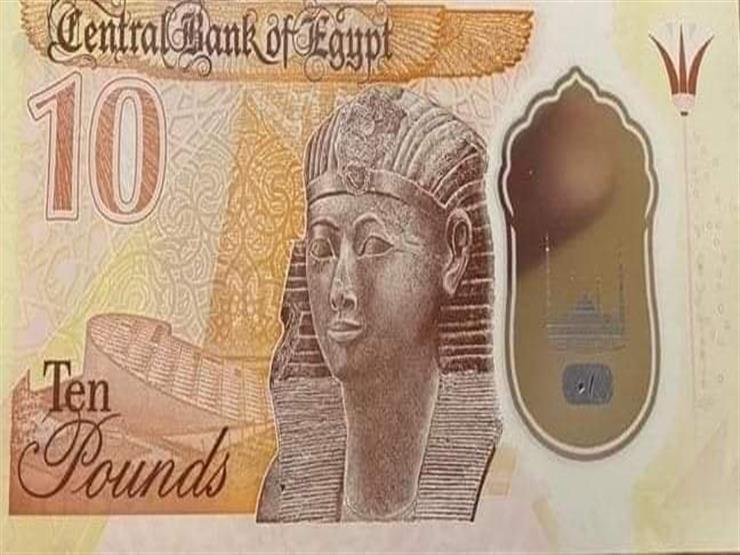
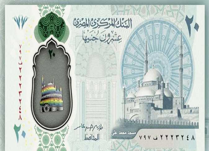
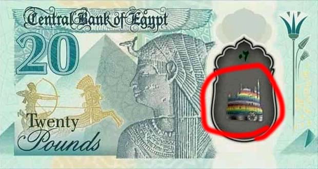
The new currency designs have been the trend on social media for a while now, and we noticed some negative feedback on the design to the extent that it was described as a “very poor design.”
We interviewed seasoned designer Fares Elsiagy, an art instructor, visual artist and Youtuber to tell us more about the disadvantages in the new currency design. When it comes to inspecting the design of the new currency, his critique is very detailed.

“The design of the new currency reveals so many flaws. In a nutshell, it’s a poor design” said Elsiagy.
“Any design should be driven by three main forces: the central object, the harmony and the variety. The central object is the most important force, as it sets the direction of the whole design. The whole design revolves around it.”
“The harmony is an aesthetic force that manifests in colors, tonality and shapes, and it gives the design a comforting impression to the eye.”
“The variety is the force that balances the choice of the design elements such as the lines, the colors, the sizes and the shapes.”
Did the design implement these forces?

“The design does not process any of the above forces. There are too many vertical lines with too many objects touching which give a hideous impression to the observer and demolish the variety force.”
“The design kills the harmony as well as it is vital in any design to prevent touching objects (unless it serves a specific concept, but the very design here does not have any concept).”
“There is no main object. All the objects have the same momentum, which makes the design chaotic and hence divert the observant eye and make it hard to maintain a solid concept.”

“There are different ways to show the importance of the main object, yet here the designer didn’t care to set a main object, which is page one in class 101 Visual Arts.”
“You cannot find variety in the sizes of the objects. They are nearly the same size and very close to each other. The colorful object on the left is misplaced with the other elements and there is no relationship between the different elements of the design. There’s lack of color harmony.”
“We have great designers and amazing artists in Egypt. I am not sure how this designer has been chosen! Actually, to me…students can do better than this!” said Elsiagy.


