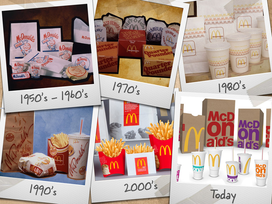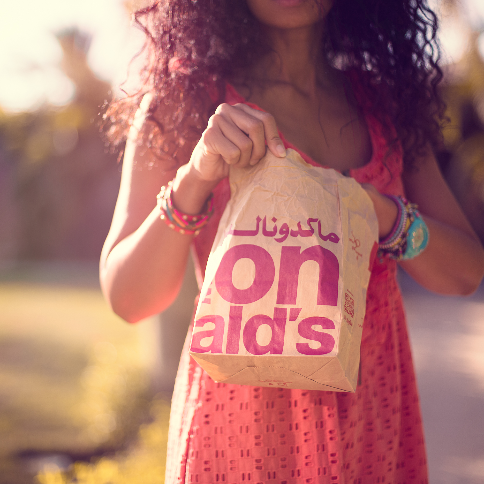
The beloved Golden Arches broke out a refreshing new design this year, embracing its global vision of a modern, progressive burger (and breakfast) company with bold yet simple new packaging.
The latest step in McDonald’s commitment to “connect with consumers” and be “at the forefront of evolving trends,” the company’s new packaging is actually pretty awesome. We’re definitely fans, and it’s super cool to see the world’s favorite fast-food brand embracing the idea that less is more.

The new design for cups, carry-out bags and sandwich boxes was rolled out across the U.S. earlier this year, and is now hitting the Middle East. We think the design is super pretty, and definitely holds up to McDonald’s ethos of ‘modern’ and ‘progressive.’
It’s also part of a bold, new step in the brand’s evolution to meet the ever-challenging expectations of its (global) consumers.

WE SAID THIS: Just remember that less is more and we’ll all be golden! (…pun intended!)


