


Think of a brand as a living mosaic — not fixed, but reflective: it bends color, repeats motifs, and rearranges rhythm to match moments. To prototype that kind of moving identity quickly, start by seeding mood plates and scene mockups using an AI photo generator in Dreamina. Those generated images help you imagine how a pattern might tilt, how a color sweep behaves under neon, or how a logo fragment could tessellate across packaging. From there, you can design systems that feel fresh every time they appear while remaining unmistakably yours.
Kaleidoscope branding isn’t chaos dressed up as strategy. Its purposeful variability: a limited grammar of shapes, a palette that shifts within set bounds, and motion rules that let assets morph without losing their voice. Below, we’ll explore how symmetry, controlled color shifts, and modular assets create brands that evolve without losing identity. Expect short, punchy paragraphs, a few tidy bullets for decision rules, and a playful Dreamina workflow to get you from experiment to export.
What makes a brand feel like a kaleidoscope
Kaleidoscope brands are recognizable because they repeat a small set of rules across many permutations. The rules are the grammar; the variations are the poetry.
- A core motif that survives scale (a petal, an arc, a micro-chevron)
- A tonal system that limits how color can shift (three families with allowed blends)
- A motion vocabulary for loops and transitions (pulse, sweep, bloom)
When these three things align, every new piece reads as “the same brand” even when the surface looks new.
Dreamina’s quick-play lab: make a shifting pattern system in an afternoon
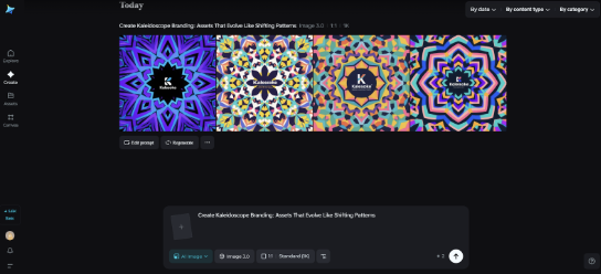
Step 1: Write a detailed text prompt
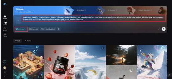
Navigate to Dreamina and write a focused prompt that describes your motif, mood, and context. Be explicit about your materials and feel so that the generative outputs can inform the behavior of the patterns you’re choosing. For example: Make mood plates for a pattern system drawing influence from folded origami and coastal erosion: key motif is an angular petal, mood is breezy and tactile, color families: driftwood grey, seafoam green, sunrise coral; produce the hero compositions for packaging, social, and a sticker sheet.
Step 2: Set parameters and generate
Assume a model that is tuned for texture and composition, choose aspect ratios for a square tile and long banner, choose size, and then resolution – 1k for quick whips, or 2k for checking detail in print. Click on Dreamina’s icon to create some directions. Review for motifs that repeat well, colorways that transition nicely, and textures that have potential to be material surfaces.
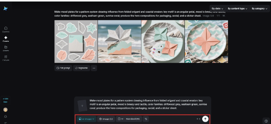
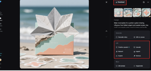
Step 3: Customize and save Leveraging Dreamina’s creative upscale, inpaint, expand, remove, and retouch tools, refine the motif of interest, make mirrored or rotated variants with the retouch tool, remove stray artifacts, and create swatches that more closely adhere colors together. When the set of tiles and mockups is working together, click on Download, and acquire high-resolution assets that you can hand to the design system and production.
Identity shaped with an AI-generated logo
A logo is more than a symbol — it is the essence of a brand condensed. With Dreamina’s AI logo generator, possibilities are endless and you can explore endless shapes, fonts, and color harmonies in minutes. We want to help creators explore multiple directions quickly, iterate and refine ideas, and conclude with a timeless and flexible design.
Design strategies for patterned consistency
Start with a motif and plot how it will behave. Does it rotate? Tile? Mirror? Keep transformations simple and repeatable so systems can be automated for social, packaging, or environmental graphics.
Think in layers: a structural grid (how elements align), a motif layer (the repeating shape), and a finish layer (texture, sheen, or grain). Separating concerns makes it easier to produce new combinations without rethinking every asset.
Color choreography: rules that let palettes wander
A kaleidoscope brand needs color rules more than a color palette. Instead of handing designers ten hex codes and walking away, define behaviors:
- Base tone (80% of the time)
- Accent shifts (used sparingly to signal mood)
- Highlight glints (micro-accents for calls to action)
Also include cross-fade ranges: which base can quietly blend into which accent without clashing. These palettes feel alive because they’re permitted to move, not because they mutate randomly.
Symmetry, but with surprises
Symmetry can be comforting, but repetition becomes boring without a twist. Use mirroring rules — flip, rotate, offset — and then introduce a consistent asymmetry (an off-center dot, a tiny notch) that anchors every composition. That small unpredictable element is what makes the system human rather than mechanical.
Motion as identity glue
Animated transitions are the secret handshake of kaleidoscope brands. Micro-animations build continuity across screens and episodes.
- A 2-second sweep for page transitions
- Staggered reveals for pattern tiles on load
- Micro-pulses for interactive states
Keep motion subtle: too much motion overwhelms, too little fails to sell the system. Test in context and provide reduced-motion fallbacks.
Scale testing: where patterns break and where they sing
Patterns look great blown up and terrible at favicon size. Run scale tests early: isolate the motif and shrink it to 16–32 pixels; does it still read? Then blow it up to billboard size. Tweak line weights and spacing until the motif survives extremes.
Community and collectability
Kaleidoscope strategies thrive on collection. Release limited pattern drops, seasonal colorways, or “artist remixes” that remain coherent because they obey the brand grammar. People love collecting variations of the same thing — it’s satisfying and drives engagement.
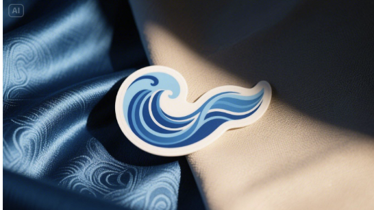
Physical proofs and tactility
Materials change perception. A silk-sheen tag reads differently from a matte kraft label even with the same pattern. Prototype finishes early; Dreamina’s sticker maker is an inexpensive way to validate die-cuts, surface finishes, and how colors shift under different substrates. Stickers travel into the world and give you honest feedback fast.
Avoid the mistake of stylistic sprawl
A kaleidoscope brand can suffer from too many degrees of freedom. Keep your rulebook small and enforce it with approvals and quick templates. Track core motif usage and retire variants that dilute recognition.
Governance: the tiny bible that keeps play useful
Write a two-page system guide: motif rules, permitted transformations, palette behavior, motion specs, minimum sizes, and reduction rules. Keep it short and visual—examples beat long prose. This “tiny bible” is what allows your brand to evolve without dissolving into inconsistency.
Quick terms for creative teams
- Weekly “pattern hour” where designers push one new color swap and test it in templates
- Monthly limited drops to invite community attention and gather feedback
- A single Slack channel for sharing pattern experiments so ideas don’t vanish
These rituals keep momentum without bureaucratic slowdowns.
Where to begin if you’re nervous
Start with one motif and two palettes. Ship one piece of collateral each week for a month; observe what performs and which variants earn saves, shares, or requests. Iterate from that human feedback rather than abstract theory.
Ending: playfully predictable, memorably variable
Kaleidoscope branding is a promise: the world will recognize you even when you look different. It’s a blend of math (symmetry, grid systems) and magic (color shifts, tactile finishes).
Dreamina accelerates that alchemy — generate mood plates, test texture and color, then refine and download patterns that scale from stickers to storefronts. Keep your rules small, your experiments frequent, and your surprises gentle. Done well, the brand will feel like a familiar song that changes keys just often enough to make people listen again.
WE SAID THIS: Don’t Miss…Inside K2 Think: How the UAE Built a Rival to OpenAI and DeepSeek